Time for Once: Book Cover Design Part I
Time. It’s the sun on a dial, numbers on a clock, wrinkles on your skin, saying goodbye, saying hello, and watching those you love grow. Life is the passage of time. Time.
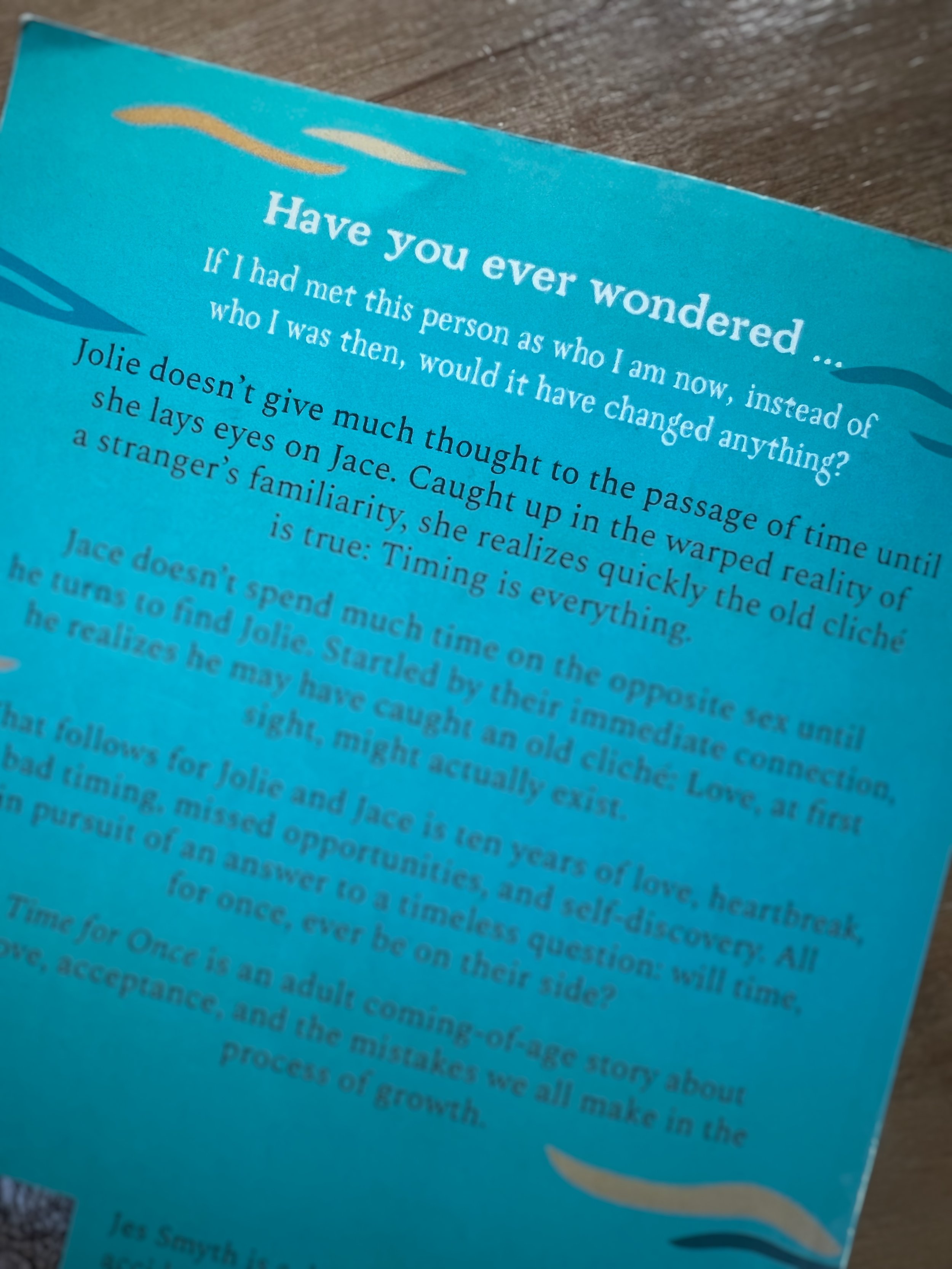
If I had met this person as who I am now, instead of who I was then, would it have changed anything?
I didn’t realize time was a central theme in Time for Once until it became apparent it was. Naturally, the title plucked itself from the prose, and the book cover design followed.
Clocks. A woman. A woman floating with clocks. Oh! A man, trying to keep her grounded.
When the first images of the book cover came in, I sent a few to my family and asked for their thoughts/reactions:
Red clocks, yes! Title in the middle, yes! Middle child does the opposite of what her family suggests, a definite yes.
Jokes aside, their feedback was valuable. As the cover came together, my sister asked about the clocks, specifically the times.
“Do the times mean anything?”
“No. But they should!”
I chose four times (there are six clocks total). One clock is the time my son was born. Another is the date Jolie and Jace meet for the first time. The third is the date of a birthday. And finally, the fourth, for whatever reason, is the time I like to go to sleep.
So, there you have it! Details are fun, right? The clocks and their matching events/dates will remain undisclosed, however. Gotta keep some things a mystery.
Next month, I’ll discuss and share the original image that inspired the artwork in Time for Once: Book Cover Design Part II
Psssttt… Are you eagerly awaiting the release of Dream for a Second? Have you read Time for Once? By leaving a review, you automatically gain access to Chapter Two in Dream for a Second!


